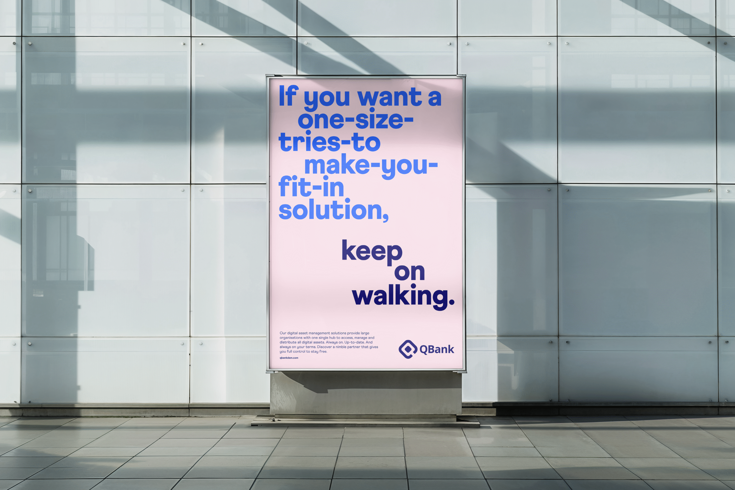
In the crowded field of digital asset management, sameness is the rule. Interfaces blend. Claims repeat. And scale is often mistaken for strength. Nordic SaaS company QBank has no intention of becoming another name in that blur.
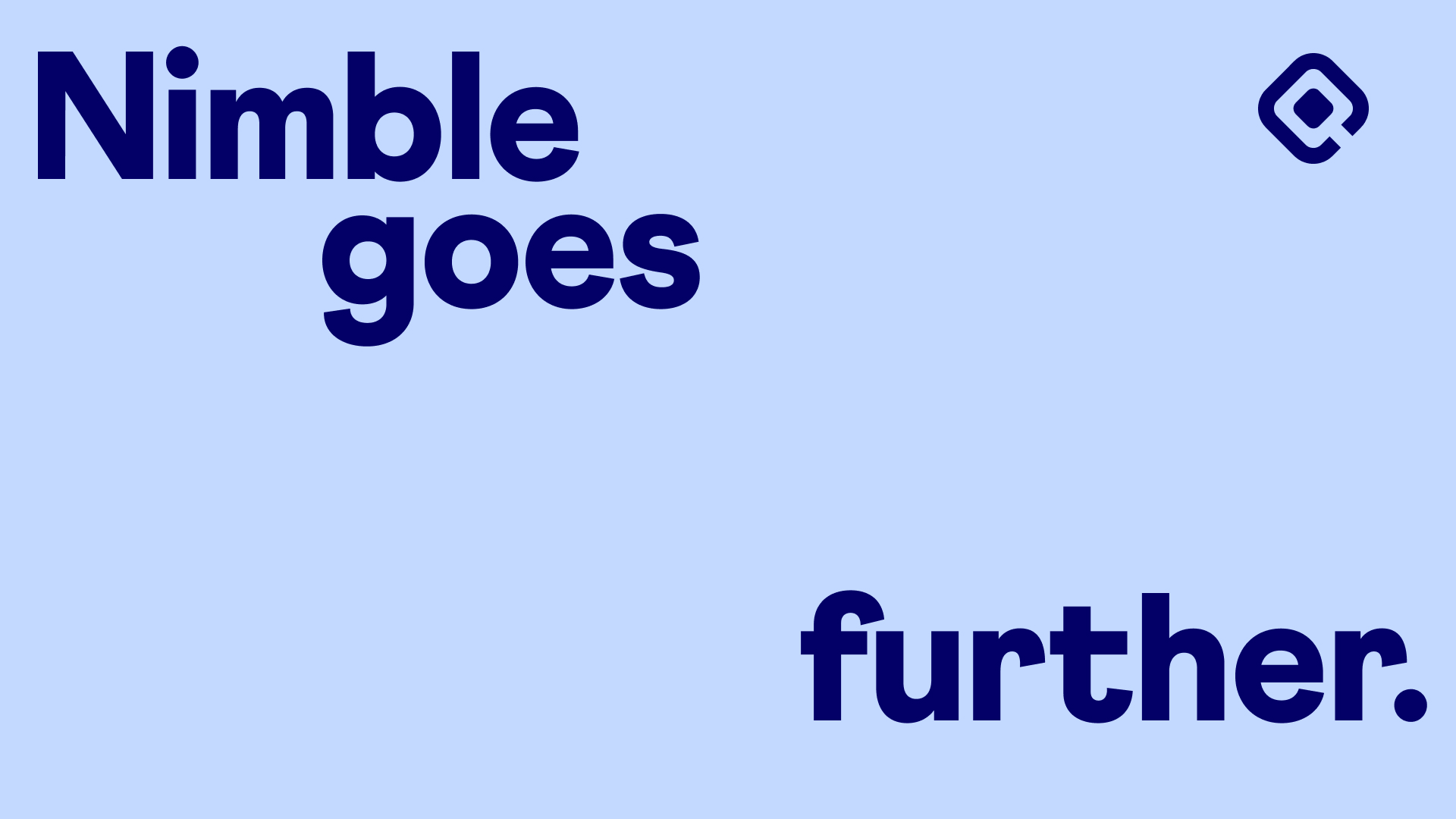
Our ambition is clear: to set Qbank apart as the challenger brand that moves faster, thinks sharper and partners more closely than the giants of the industry. The answer lay in embracing what sets Qbank apart. Small in size but big in impact, they could offer large organisations what the larger players could not: speed, focus and genuine partnership. This thinking became the foundation of a new brand platform built on the idea that nimbleness goes further.
A confident and energetic brand.
From this position, Qbank’s personality sharpened into something bolder. Confident and curious, their voice speaks of freedom from complexity and with a determination to push beyond convention. Visually, the identity evolved into a system that is at once modern and flexible, carrying the clarity of Nordic design but with the edge of a true challenger.
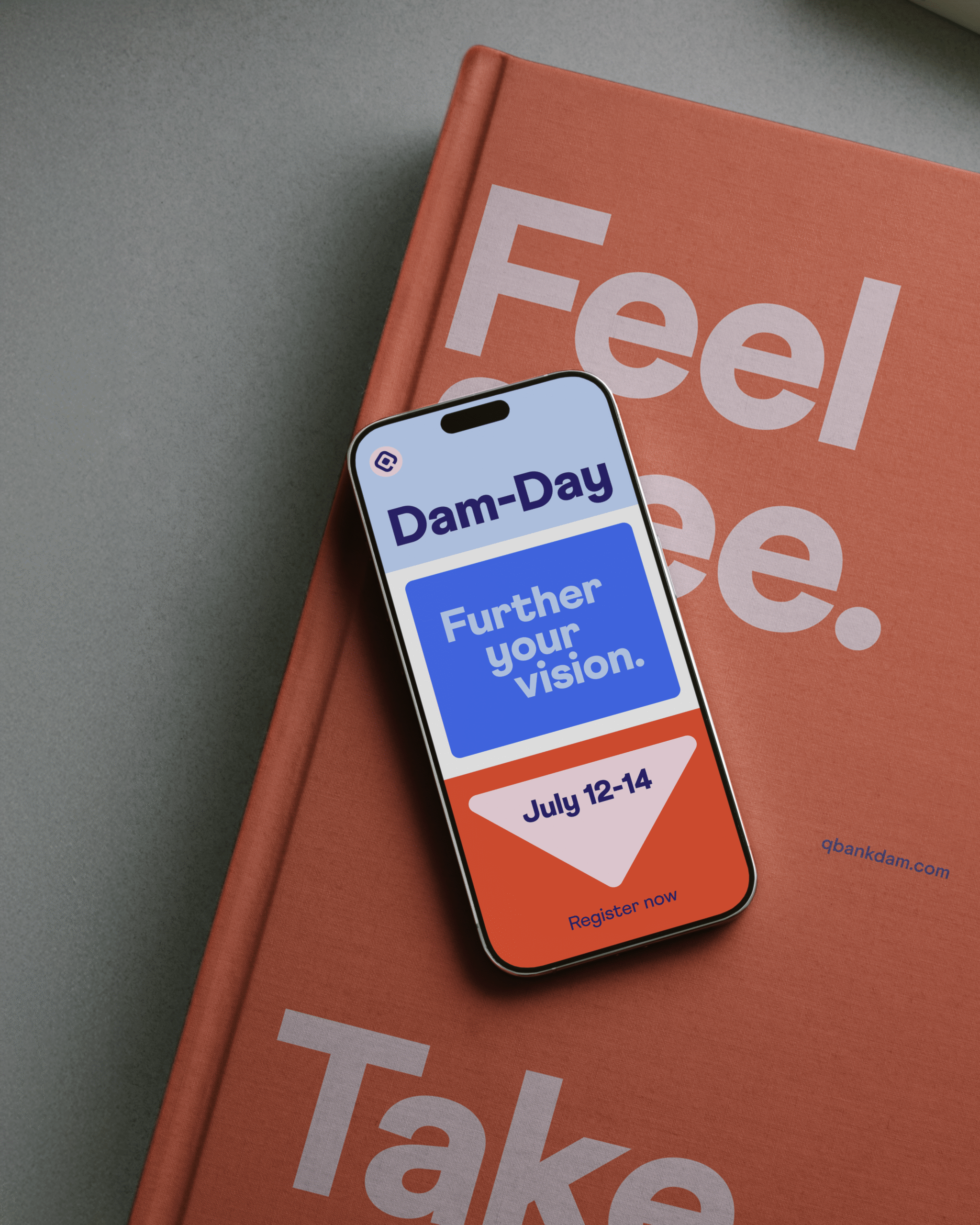
Step by step towards the vision.
And this is not a finished story. The work is ongoing, as the brand continues to transform and the new platform is woven into Qbank’s communication and customer experience. Each step strengthens the position and reinforces the promise: that working with QBank means always being ahead, never weighed down by yesterday’s solutions.
In a generic category, Qbank plays in its own league. Distinct, self-assured and true to its heritage, it shows size is not everything. Nimbleness is.