Instantly recognizable. Emotionally appealing. In a cluttered category of functional products, a strong brand can make all the difference. Working with Cricket rebranding, one of the key challenges was how to make the products more distinct.
Having launched its first product in 1961, Cricket is today one of the world’s leading lighter manufacturers. Yet despite its long heritage, Cricket products have struggled with distinctiveness and recognition.
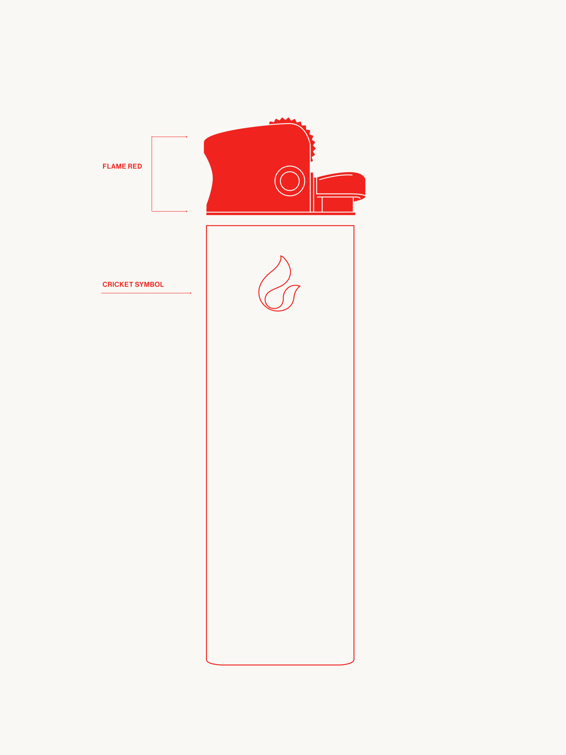
In this category, most manufacturers rely on a variety of sleeve designs, themes and infinite color ranges to stand out, making the category both cluttered and generic. So, to make the Cricket products more distinctive, we needed to integrate key brand design pillars into the product itself, rather than using design merely as decoration.
”Unlike some competitors, we hadn’t successfully established strong, unique brand elements that could be identified in a split second.”
— Filip Wahlström, Head of Marketing Swedish Match
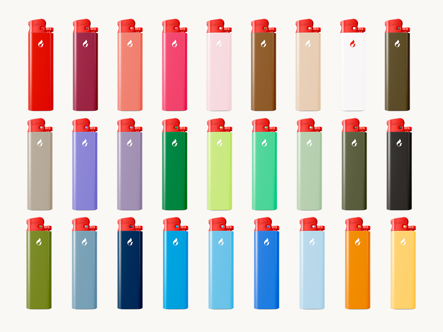
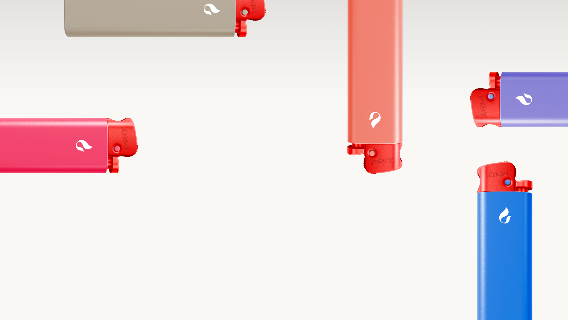
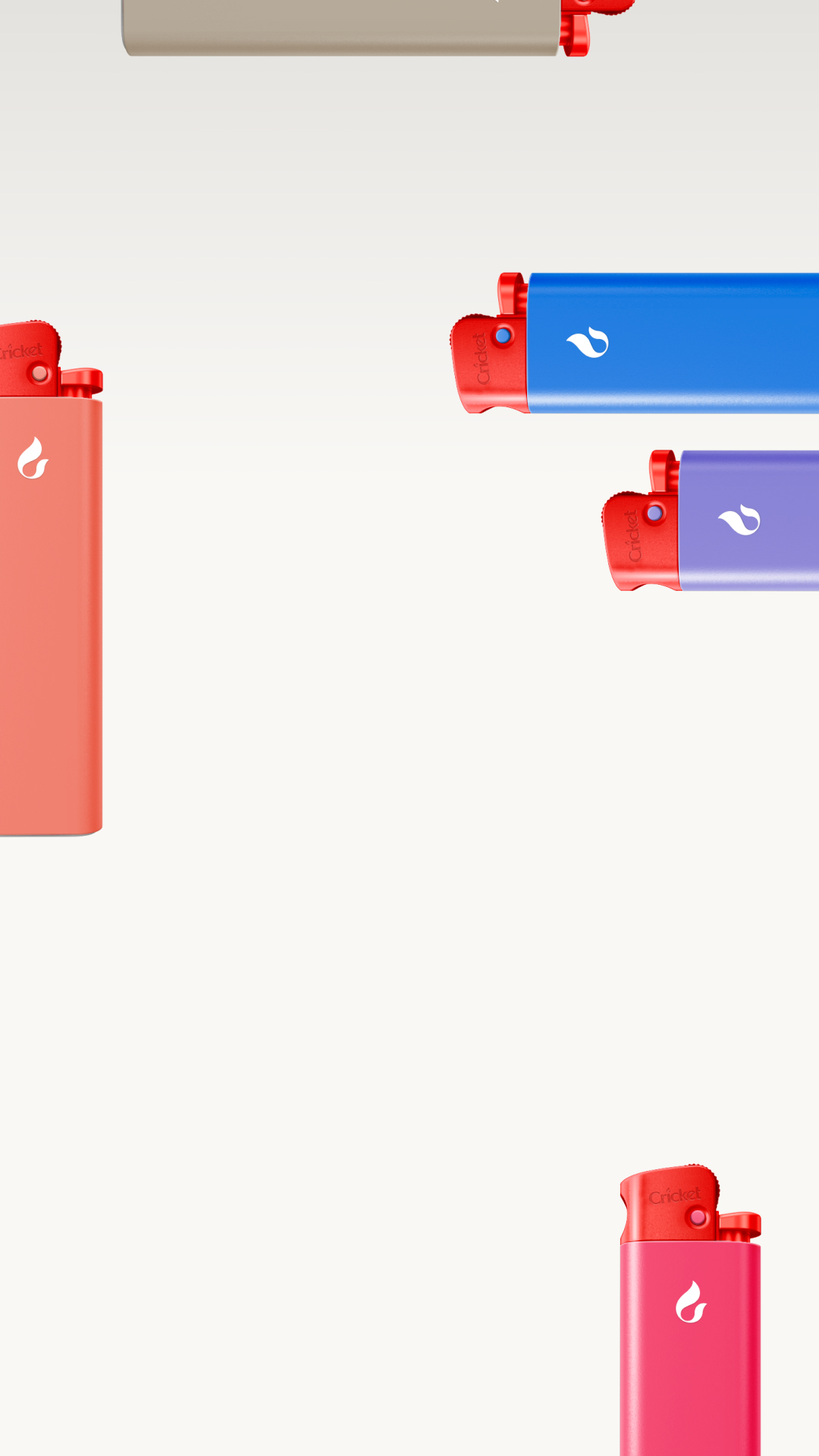
Today, the red colour is more consistently integrated throughout the product range. This makes the Cricket red a key brand asset used through the whole brand – from marketing and channels to products and packaging. We also developed a new dedicated brand color palette. It offers a wide variety in combinations, while keeping the Cricket brand consistent and recognisable. And the iconic Cricket logo is now accompanied by the “Responsibly Made” lockup, designed to highlight the responsible features used in the production of the products.
The result is not just a more distinctive end product, but a clear product design direction – one that integrates prominent brand elements into all future Cricket products.