Friberg ADVSY helps corporations and organizations accelerate their sustainability communication to position themselves as leaders within the green transition. And now this new company also has a new look.

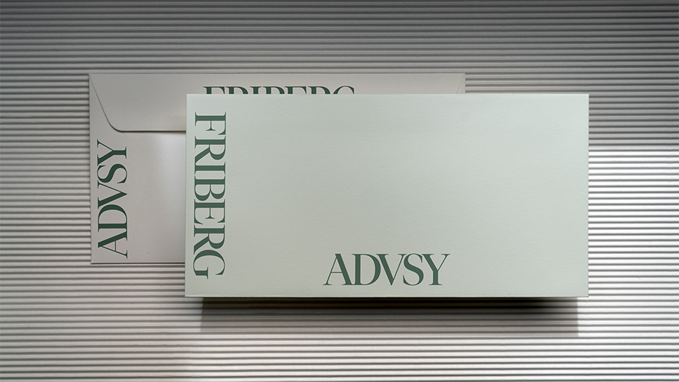
Friberg Advisory steps away from the predictable and into something sharper. Even the name got trimmed down to ADVSY, shorter, bolder, sharper. It’s a small cut that says a lot: I’m modern, I’m confident, and I get to the point.
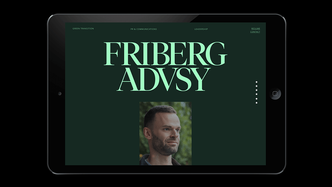
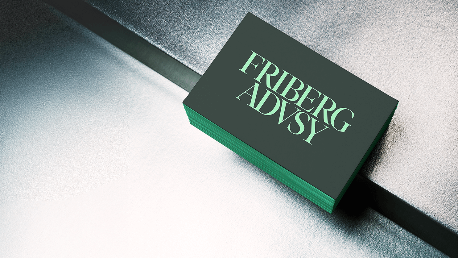
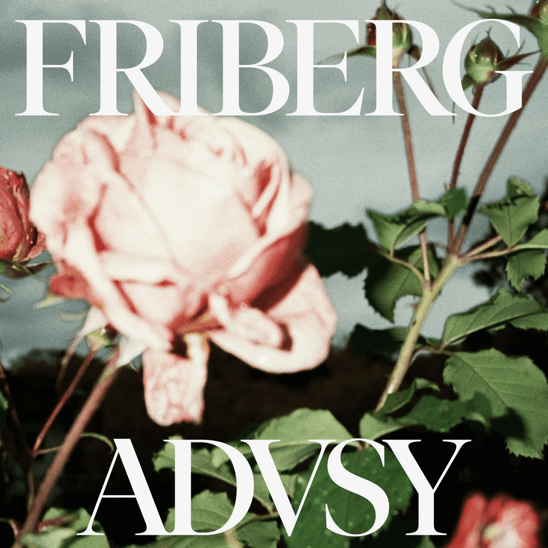
The identity is built the same way. Big, elegant type that owns the room. A green palette that’s less “eco cliché” and more “serious change-maker.” Minimal pieces, applied with enough edge to stay memorable, enough restraint to stay credible. Friberg Advisory stands out by combining editorial sophistication with a green, progressive edge. And when the logo itself shifts and separates, it shows the same thing the brand stands for: focus when it matters, flexibility when it counts.
This brand shows strength in focus, not in frills. It shows competence straight up, reliable, intelligent and with just enough attitude to remind you it’s here to make a real impact.
Friberg ADVSY is the consultant who speaks clearly, acts boldly, and brings both experience and energy into the room. Confident but never stiff. Professional but never dull. Always moving, always involved, always pushing things forward.